Forward-thinking in real estate
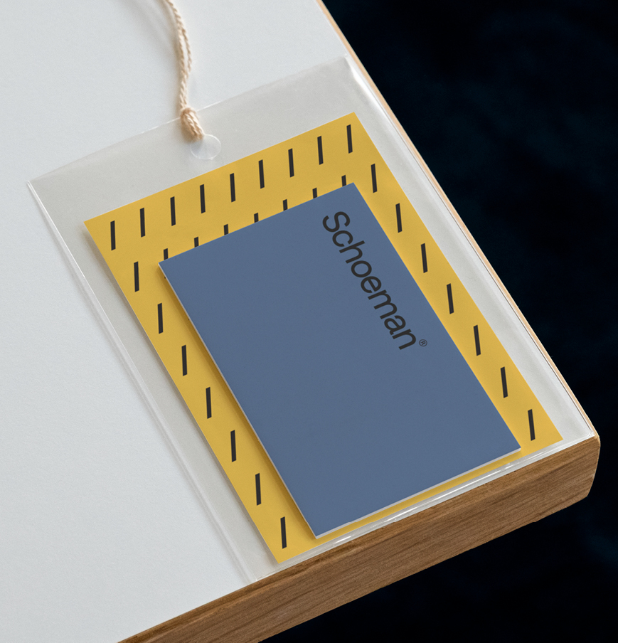
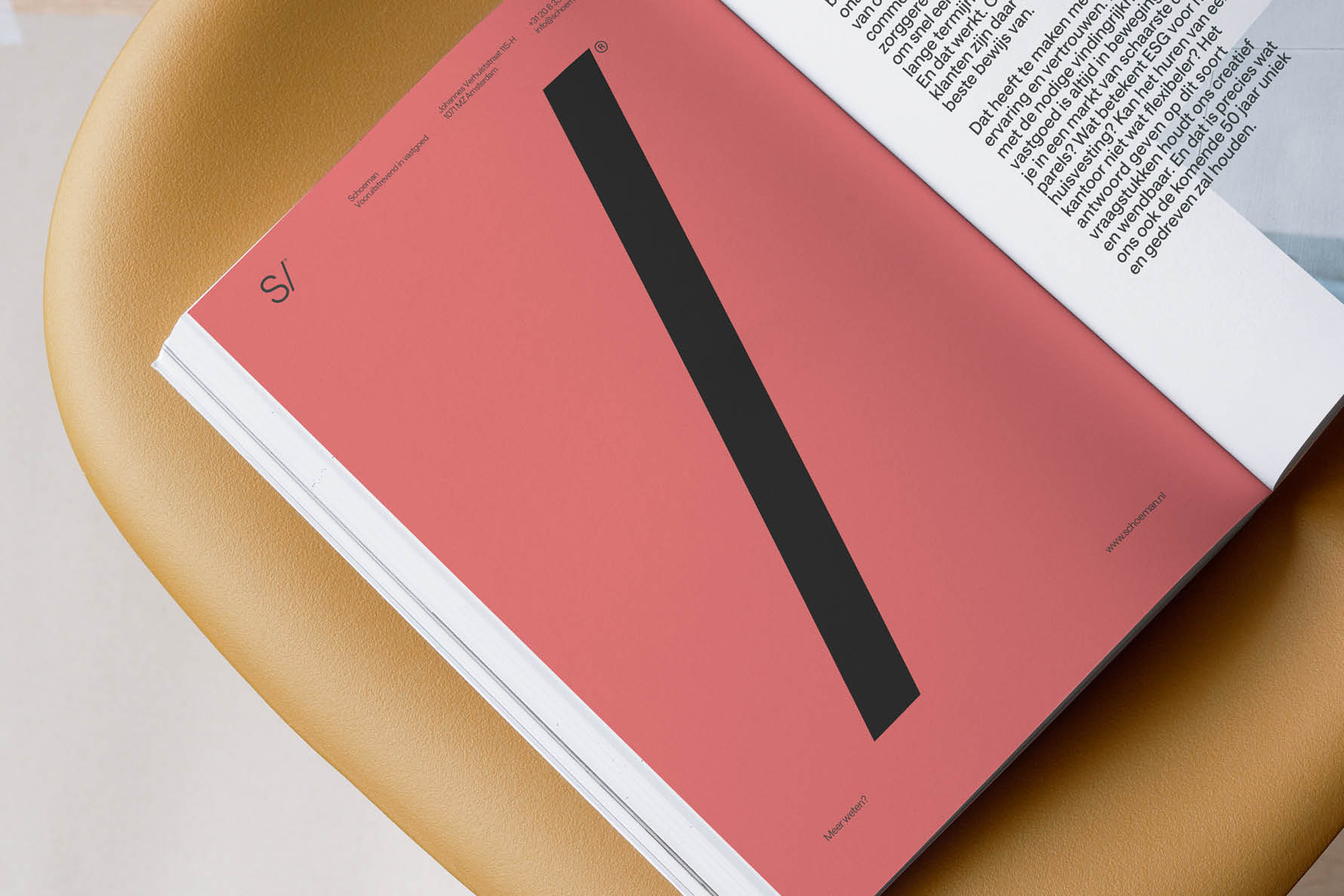
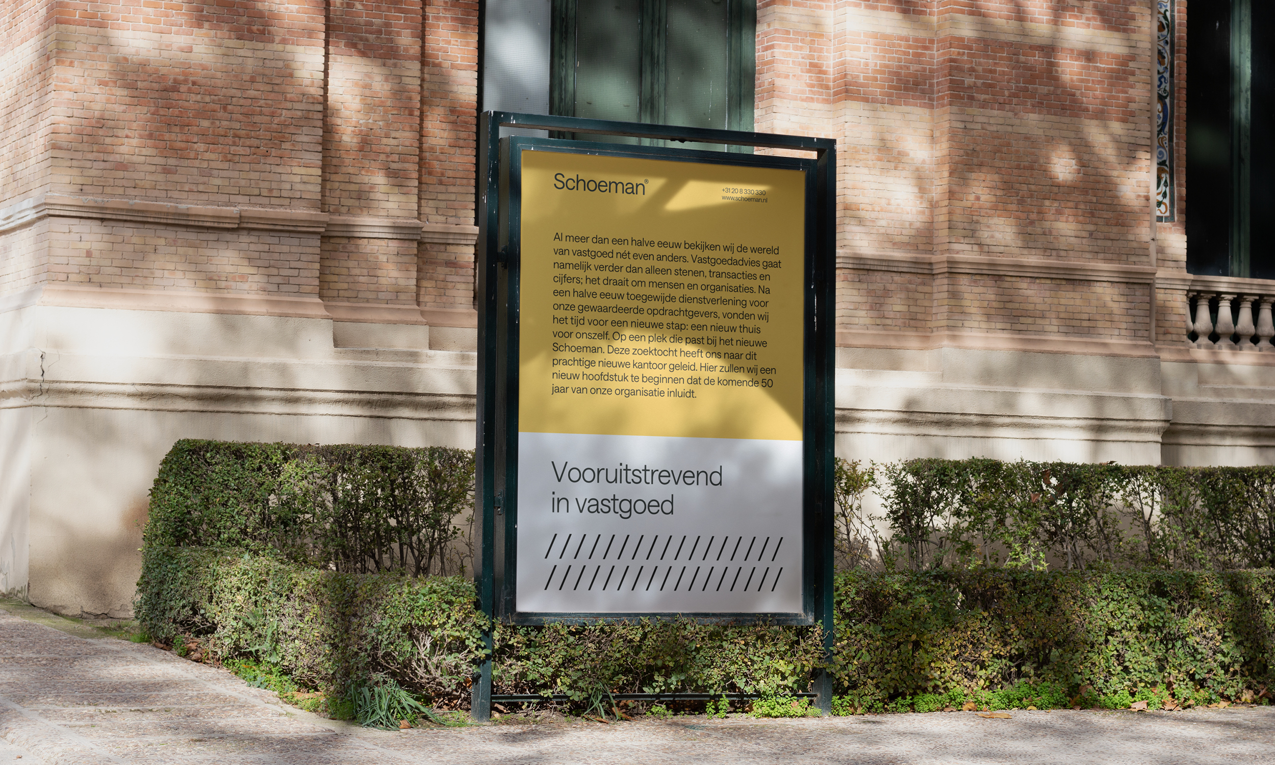
In our collaboration with Schoeman, we were tasked with not only rebranding but also solidifying their market positioning. Through in-depth sessions with their team, we uncovered Schoeman's unique qualities: their agility, innovative approach, and pioneering spirit. We distilled these insights into a "forward-thinking" brand positioning, symbolically incorporating a forward slash in their visual identity.
Services
Brand Strategy
Brand identity
Motion design
Website
Credits
Frank Jansen (Creative Direction)
Rick Böing (Motion Design)
Seamless (Web Development)

In close collaboration with Marnix Schoeman, we developed a forward-thinking brand approach built around a simple yet striking element: the forward slash. As a modern brand icon, it brings a contemporary edge and a distinctive visual signature. A strong, modernistic grid system underpins the entire identity, giving it structure, clarity, and a timeless Schoeman character.