Going all in on Zadelhoff red
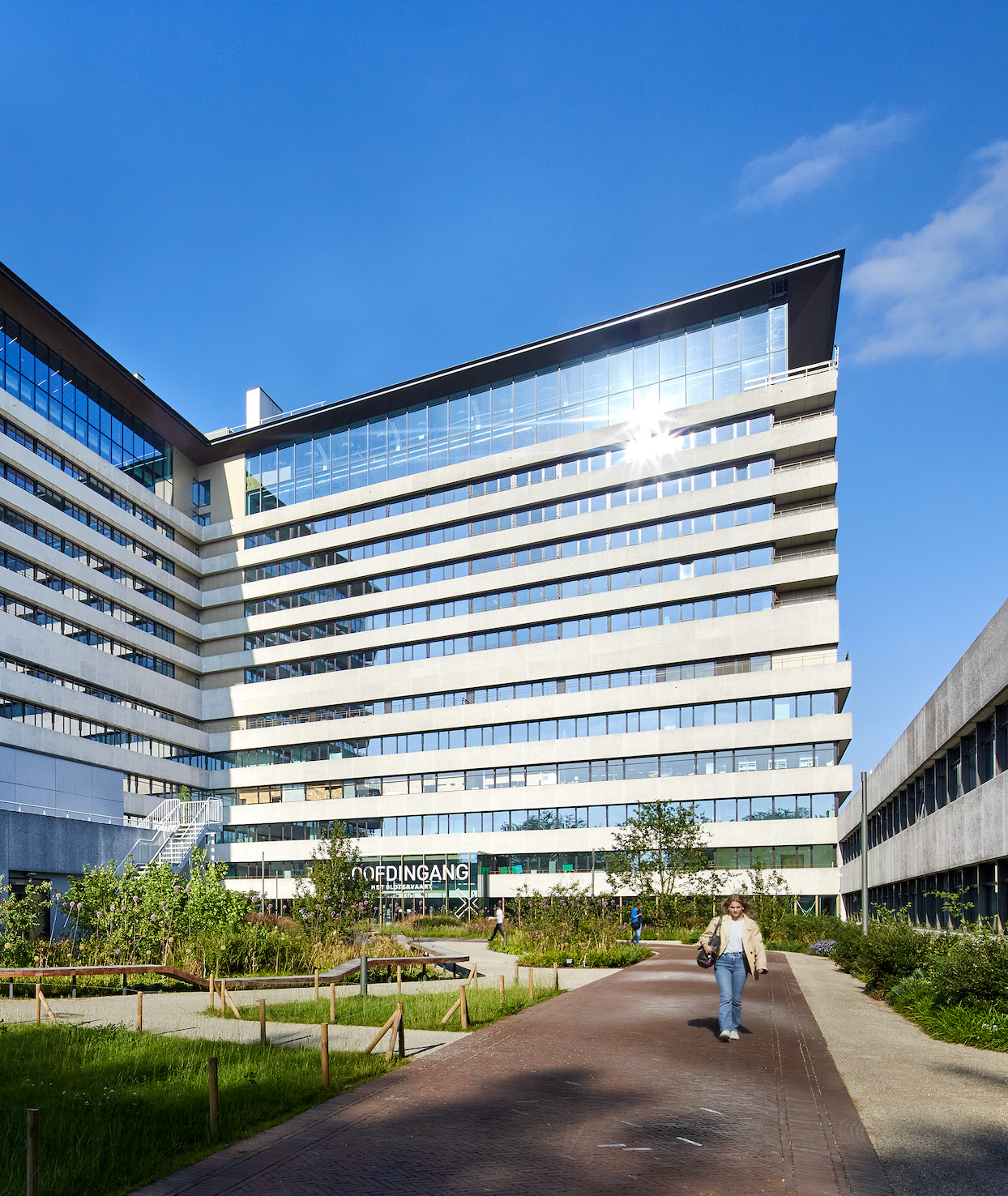
Zadelhoff has been a cornerstone of Amsterdam’s real estate world for decades, shaping the city through the development and preservation of its most iconic buildings. A couple of years ago, a significant part of the company was placed in the hands of charitable foundations, reinforcing its social impact. We created a distinctive positioning and brand identity that builds on this legacy.
Services
Brand Identity
Brand Strategy
Website
Credits
Frank Jansen (Creative Direction)
Rick Böing (Motion Design)
Milan Hofmans (Photography)
Seamless (Web Development)


The familiar logo and the unmistakable Zadelhoff red were preserved and elevated, complemented by rich, fresh tones across varying backgrounds to bring new depth and energy. The brand promise “Zadelhoff for good” captures the essence of the company: practical, effective, and full of character. This idea runs through the grid, imagery, and overall visual language.